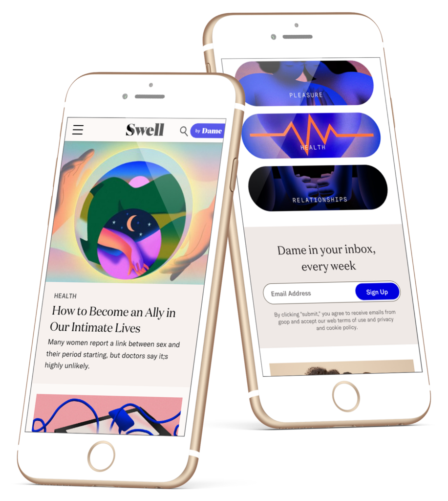
Swell
Dame needed to reach new customers without violating guidelines. They did this by creating Swell, an ad-friendly content resource focused on lead collection and brand awareness. There have been three versions of Swell. This case focuses on version 3, which was executed in five weeks.
Role
Lead UX/UI Designer (v2-3), Project Owner (v3), Front-End Developer (all)
Tools + Skills
Sketch, Invision, WordPress, Cross-Functional Collaboration
Duration
Background
Since its launch, Swell has undergone three iterations. At the time of the redesign discussed in this case study, Swell 2.0 was live.
Swell 1.0
Launched January 2020
The initial iteration of Swell was designed as a unique brand experience to attract potential customers through Facebook ads without featuring content that would violate guidelines.
The version featured distinct visual branding, with a funky font called Blenny instead of Dame's primary serif font, Domaine Display. As a UX consultant, I guided the user experience to the graphic designer handling the UI.

Swell 2.0
Launched May 2020
Swell 2.0 integrated Dame's visual branding while retaining the Swell name. Dame's primary font, Domaine Display, replaced the Blenny font, and the colors were updated to match Dame's brand colors.
Given Swell 1.0's underperformance, I collaborated with the e-commerce director to spearhead the redesign to align it with Dame's overall branding and enhance the user experience.

Dame.com
Launched November 2021
The goal of Dame.com was to create a seamless experience between products and content, making it feel like a home base for Dame's offerings rather than simply an extension of the brand.
As the sole designer, I collaborated closely with the CEO and COO for their feedback. I also helped shape the content to tell Dame's story better. This case study explores this iteration.

Challenges
Dame faced a significant challenge in 2021 after winning the right to advertise on the NYC subway following a lawsuit against the MTA. However, the settlement terms required them to redirect the campaign to their blog, Swell, instead of their online store.
Several constraints added to the challenge:
- TimingWith five weeks’ notice, right before the holidays, we had to pivot to work on the tight timeline.
- DestinationWe were required to link to Swell instead of the store. However, the blog had been deprioritized without an editor for six months.
- ContentSwell was not intended for product integration and failed to introduce users to Dame's brand story. No new articles had been published for six months, and the new editor was not scheduled to join the team until shortly before the launch.
- TechnicalAs the UX/UI Engineer, I was additionally responsible for coding the redesign and managing the migration of the hosting and domain.
Solutions
To overcome these challenges on an expedited timeline, I focused on a few key strategies.
✍️
Efficient Design
To expedite the design and development process, I concentrated on improving Swell's existing design while tailoring it to meet the requirements of the new version. I aimed to leverage as much of the current design as possible.
📚
Improved Storytelling
I revamped the experience to enhance storytelling since the subway advertisements required deliberate vagueness. The crucial objectives were providing users with a proper context and guiding them on their journey.
💬
Cross-Functional Communication
To assist the new editor who was joining us just two weeks before launch, I developed a filterable spreadsheet of all existing articles. This helped her quickly identify top-performing content and potential optimizations, enabling her to create the required content before the launch.
👩💻
Technical Implementation
To handle the server and domain changes, I hired an assistant developer to help with that aspect. With their help, we efficiently migrated the hosting and domain to a new platform, improving site speed and reliability.
Discovery
To create a seamless experience between Dame.com and the e-commerce storefront, I conducted extensive research on contextual commerce and analyzed the patterns used by industry leaders.
Through this competitor research, I gleaned valuable insights that informed our strategy:
Be explicit about what Dame is.
As the 360 campaign primarily focused on generating awareness, we couldn't rely on subtle hints like the "g" banner on Into The Gloss. Therefore, we communicated our brand and its offerings throughout the website.

Prioritize products at a top level.
Our competitors gave their storefronts top billing in their navigation and provided ample real estate for their products throughout their pages. Therefore, we prominently showcased our products and ensured they were easily accessible to our customers.

Improve product integration.
Inspired by Food52's "From Our Shop" module, I created a similar feature that linked articles featuring products with a clear call-to-action to purchase.

Design Process
Wireframes
We prioritized the most important screens to accelerate our design process - the home, article layout, and category view. We knew nailing down the structure was crucial, so we started with wireframes to establish a solid foundation.

During the design process, we debated whether to use an article or a hero image to introduce customers to the brand. After careful consideration, we opted for the latter, which proved more effective in capturing the user's attention and generating interest in our content.
Initially, we had planned to feature our products lower on the page to adhere to design guidelines. However, we soon realized this would make them less accessible to customers. Therefore, we decided to move them below the fold, ensuring easy accessibility and increasing the likelihood of conversions.
Prototypes
To ensure a seamless user experience, I created high-fidelity mockups and prototypes before proceeding with the build.


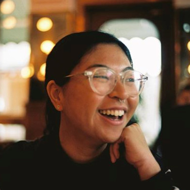
Initially, we had intended to use campaign imagery for the header. However, the mockups allowed us to recognize the abundance of illustrations required a more human touch. Therefore, we replaced the illustration with a lifestyle photo that added a relatable element to the design, allowing users to connect with the person in the image and enhancing the overall user experience.


Overall, we created a user-friendly website that effectively showcased our brand and products by prioritizing essential screens, using wireframes to establish a strong foundation, and refining our design with high-fidelity mockups and prototypes.


Takeaways
- The blog's e-commerce revenue within just 2.5 months after the redesign matched the revenue generated in the entire previous year, highlighting the significant impact of the redesign on revenue generation.
- Tight timelines can be challenging but can also force us to focus on the essentials. In this case, I had only five weeks and a hard deadline. We had to prioritize features and make quick decisions. I learned that having a clear vision and goal from the beginning was crucial for keeping us on track.
- Empathy is essential during a stressful project. Although optimizing articles was not my responsibility, I recognized that the new editor would need help familiarizing herself with the existing content. By giving her a headstart, we ensured that Dame.com was ready in time for launch.
It wouldn’t be out of place to describe Lauren as a “unicorn”. Not only does she have the technical and design skills to implement, she has the analytical ability to improve conversion and process. Lauren also works cross-functionally with ease by being a fast, reliable and communicative team player. This combination of soft and hard skills made Lauren an incredibly valuable addition to the Dame team.